Designing motivation is not about one feature, it's about building a system of habit loops. This is the full journey behind the Athlete Score, Streak, and Apple Watch remote control.
Overview
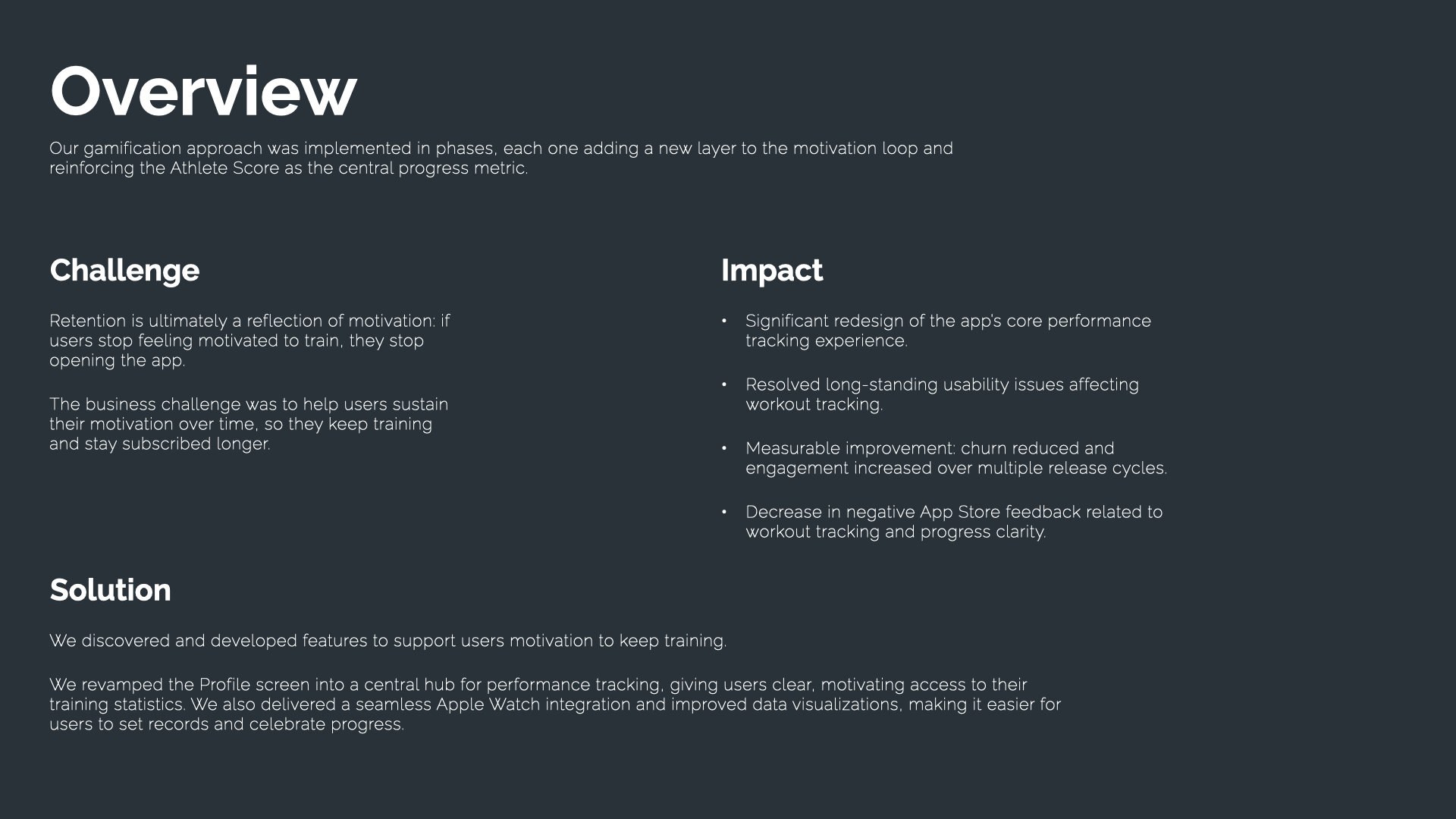
Challenge: retention is ultimately a reflection of motivation, if users stop feeling motivated to train, they stop opening the app. The business challenge was to help users sustain motivation over time so they keep training and stay subscribed longer.
Solution: we discovered and developed features to support that motivation, revamping the Profile screen into a central hub for performance tracking, adding a seamless Apple Watch integration, and improving data visualizations so users could set records and celebrate progress.
Fig. 01 — Challenge, Solution and Impact overview.
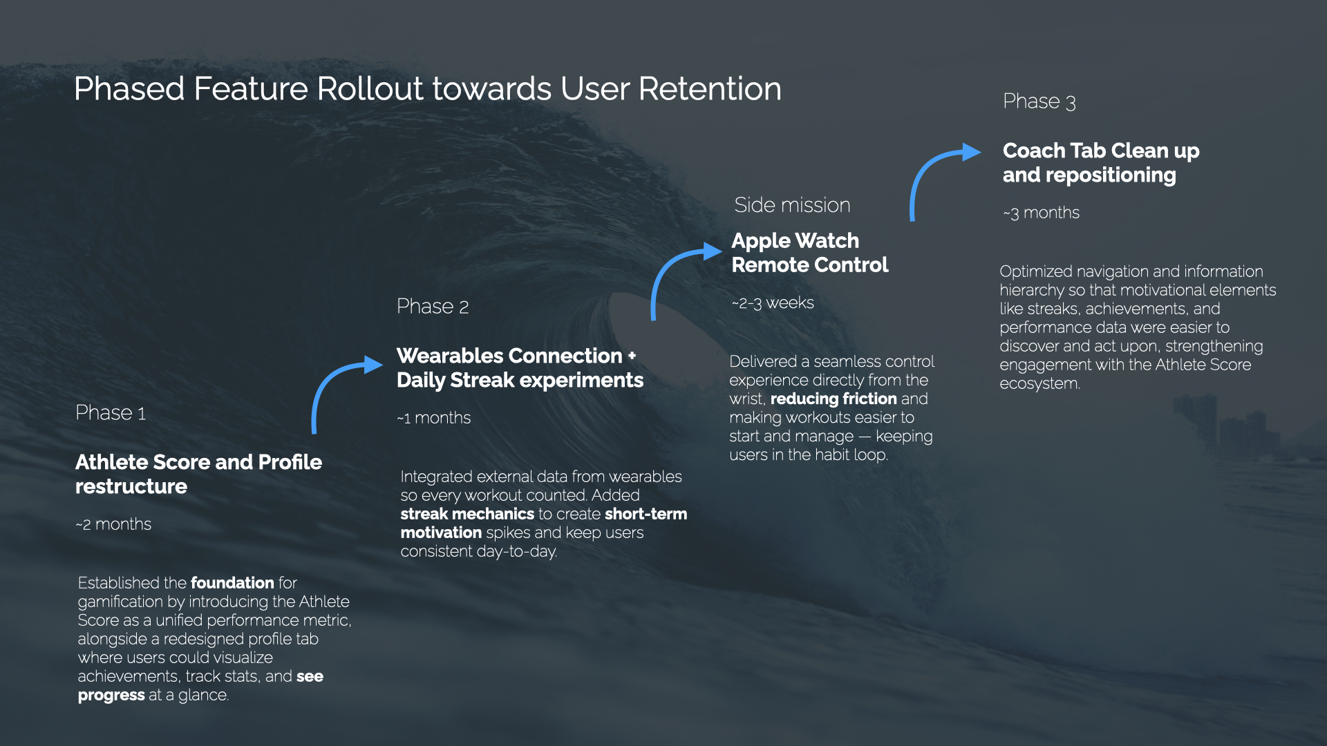
Phased Feature Rollout Towards User Retention
Phase 1 (~2 months): Athlete Score and Profile restructure, established the foundation for gamification, introducing the Athlete Score as a unified performance metric alongside a redesigned profile tab. Phase 2 (~1 month): Wearables Connection + Daily Streak experiments, integrated external data from wearables so every workout counted, and added streak mechanics for short-term motivation spikes. Side mission (~2-3 weeks): Apple Watch Remote Control, delivered seamless control from the wrist. Phase 3 (~3 months): Coach Tab clean up and repositioning, optimized navigation so motivational elements were easier to discover and act upon.
Fig. 02 — The 3-phase roadmap, plus the Apple Watch side mission.
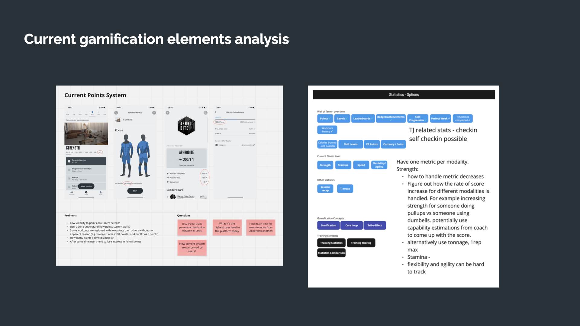
Current Gamification Elements Analysis
We started by auditing the existing points system: low visibility to points on current screens, users didn't understand how the points system worked, and workouts were assigned inconsistent point values with no apparent reason. That audit set the real starting line for the redesign.
Fig. 03 — Auditing the current points system and its problems.
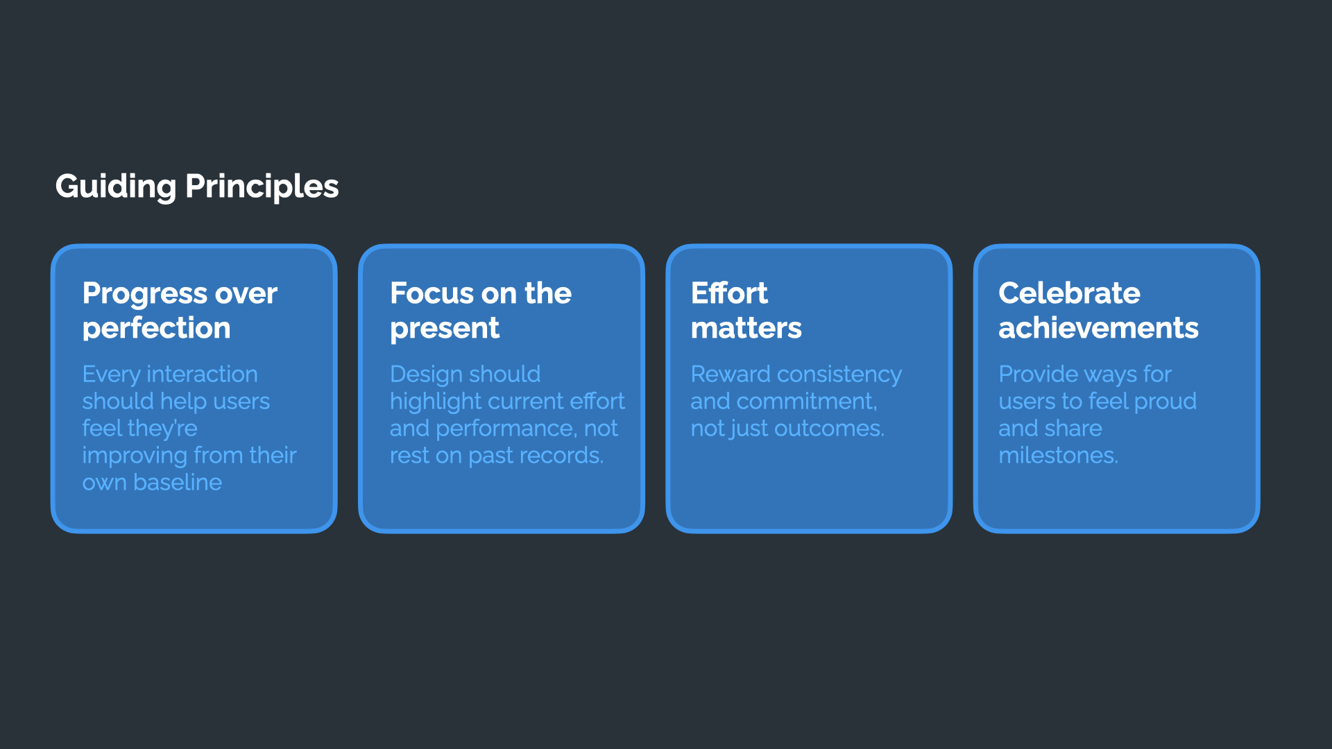
Guiding Principles
Progress over perfection, focus on the present, effort matters, celebrate achievements, four principles that shaped every decision that followed.
Fig. 04 — The four guiding principles behind the redesign.
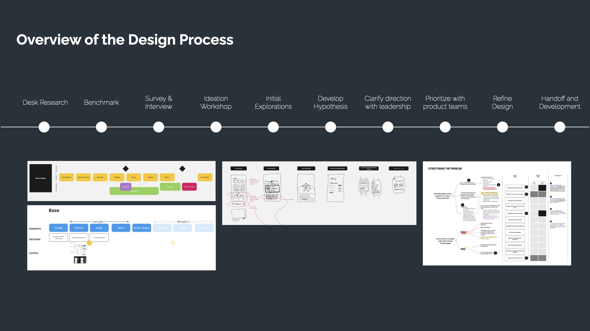
Overview of the Design Process
From desk research and benchmarking through survey and interviews, ideation workshops, initial explorations, developing hypotheses, clarifying direction with leadership, prioritizing with product teams, refining the design, and handoff to development, a full end-to-end process, not a single design sprint.
Fig. 05 — The end-to-end design process, from desk research to handoff.
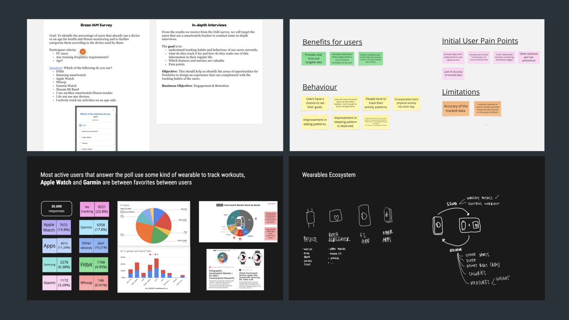
Research: Survey and Interviews
A Braze IAM survey identified what share of users already used a wearable, followed by in-depth interviews to understand tracking habits and pain points. More than 75% of active users had some kind of tracking device, Apple Watch and Garmin were the most popular, combining 40% of active users, while 25% had no tracking device at all. That split shaped the whole wearables strategy.
Fig. 06 — Braze IAM survey, in-depth interviews, and wearables market share.
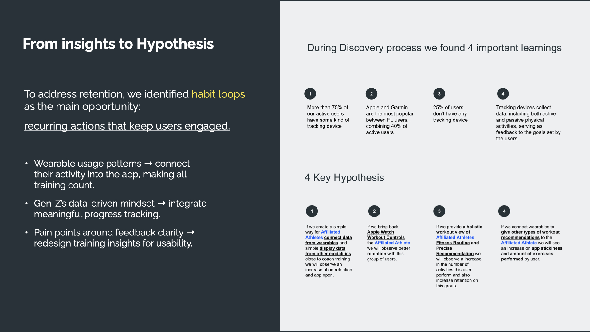
From Insights to Hypothesis
To address retention, we identified habit loops as the main opportunity, recurring actions that keep users engaged. Four key hypotheses came out of discovery: connect wearable data to make all training count, bring back Apple Watch workout controls, provide a holistic fitness routine view, and give workout recommendations across other modalities, each framed as an explicit if/then bet on retention and app stickiness.
Fig. 07 — The 4 key hypotheses that came out of discovery.
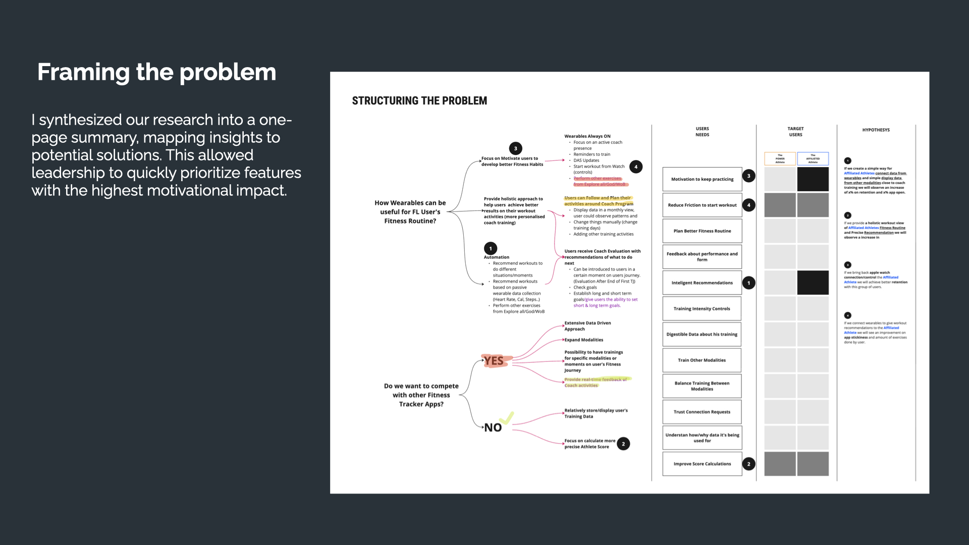
Framing the Problem
I synthesized the research into a one-page summary, mapping insights to potential solutions. This let leadership quickly prioritize the features with the highest motivational impact, plotted against a Power Athlete vs. Affiliated Athlete matrix, so priority wasn't a guess, it was tied to who each feature actually served.
Fig. 08 — Structuring the problem: insights mapped to solutions and prioritized by target user.
Testing and Defining Hierarchy
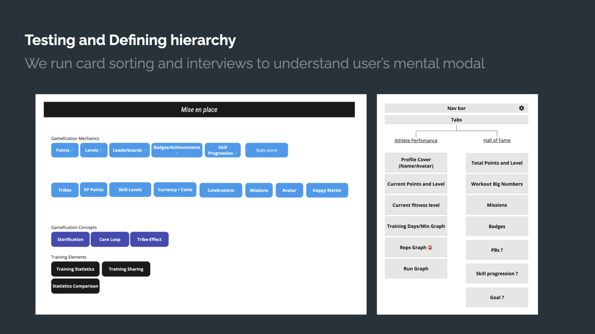
We ran card sorting and interviews to understand users mental model, which gamification mechanics (points, levels, leaderboards, badges) actually mattered to them, and how information should be organized between an Athlete Performance tab and a Hall of Fame tab.
Fig. 09 — Card sorting to define gamification mechanics and information hierarchy.
Iterate and Test Quickly to Balance User Needs, Technical Constraints and Gradual Development
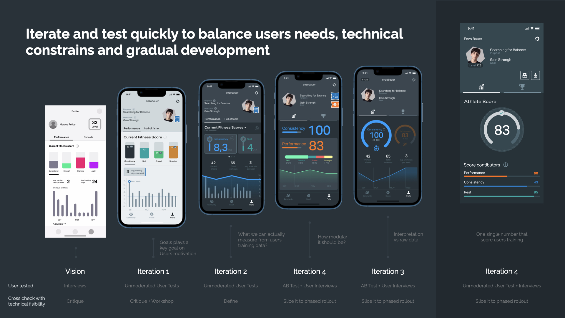
The Athlete Score went through five distinct iterations before launch. Each version asked a sharper question than the last: what can we actually measure from user training data? How modular should it be? Interpretation vs raw data? We landed on one single number that scores a user's training, but only after every version was user tested and cross-checked with technical feasibility.
Fig. 10 — Five iterations of the Athlete Score, from concept to one single number.
We Run Unmoderated Tests With Real Users for Quick Learning and Iteration Before First Release
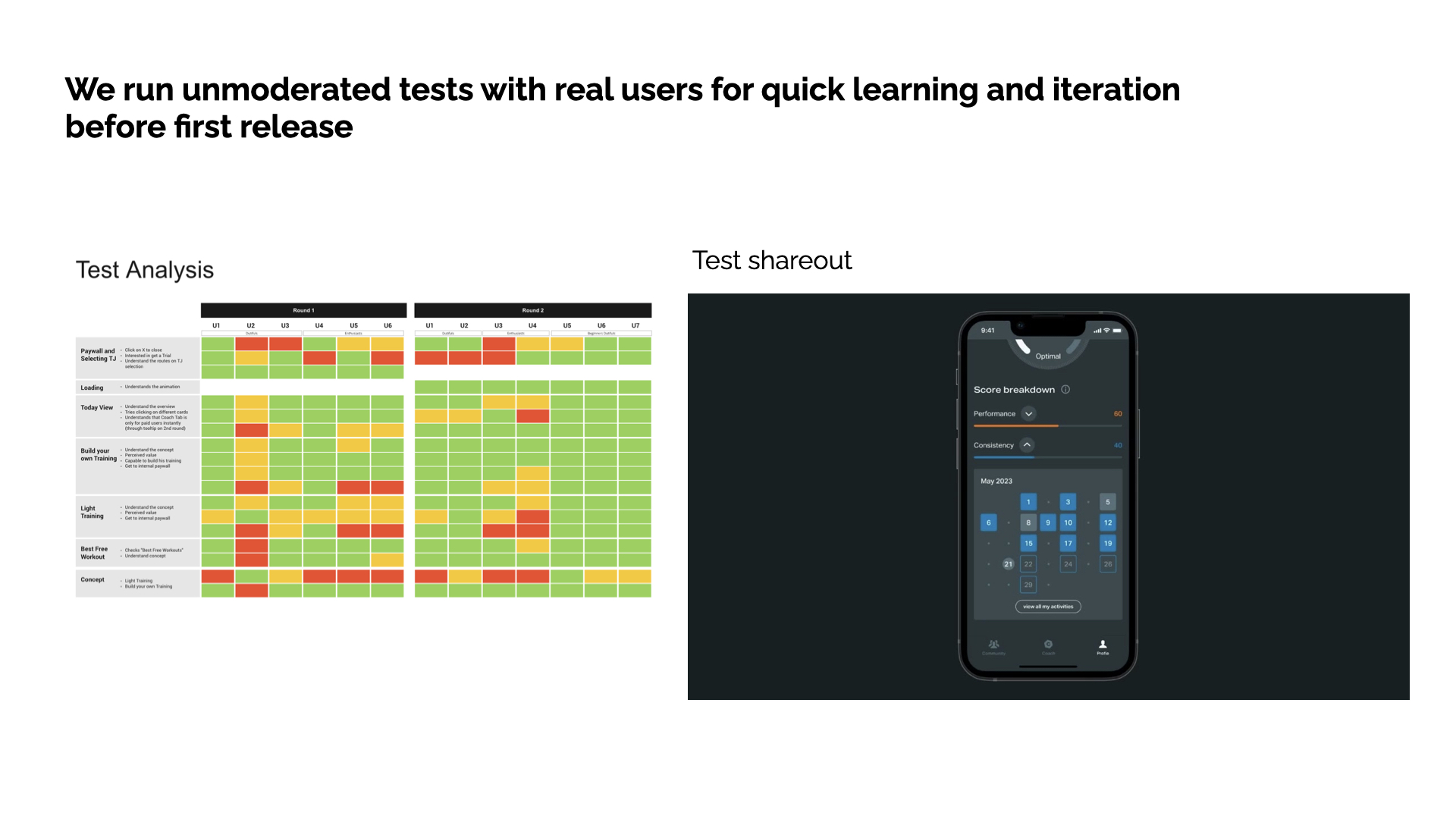
Test rounds were tracked screen by screen, paywall and TJ selection, loading, today view, build your own training, light training, best free workout: flagged green, yellow or red by how well users understood each concept. We shared results as short video reports: digestible for stakeholders, easy to spread across internal channels, and a way to share the excitement users felt directly.
Fig. 11 — Test analysis heatmap and video report shareout.
Hypothesis Coach Tab Improvements for New Users
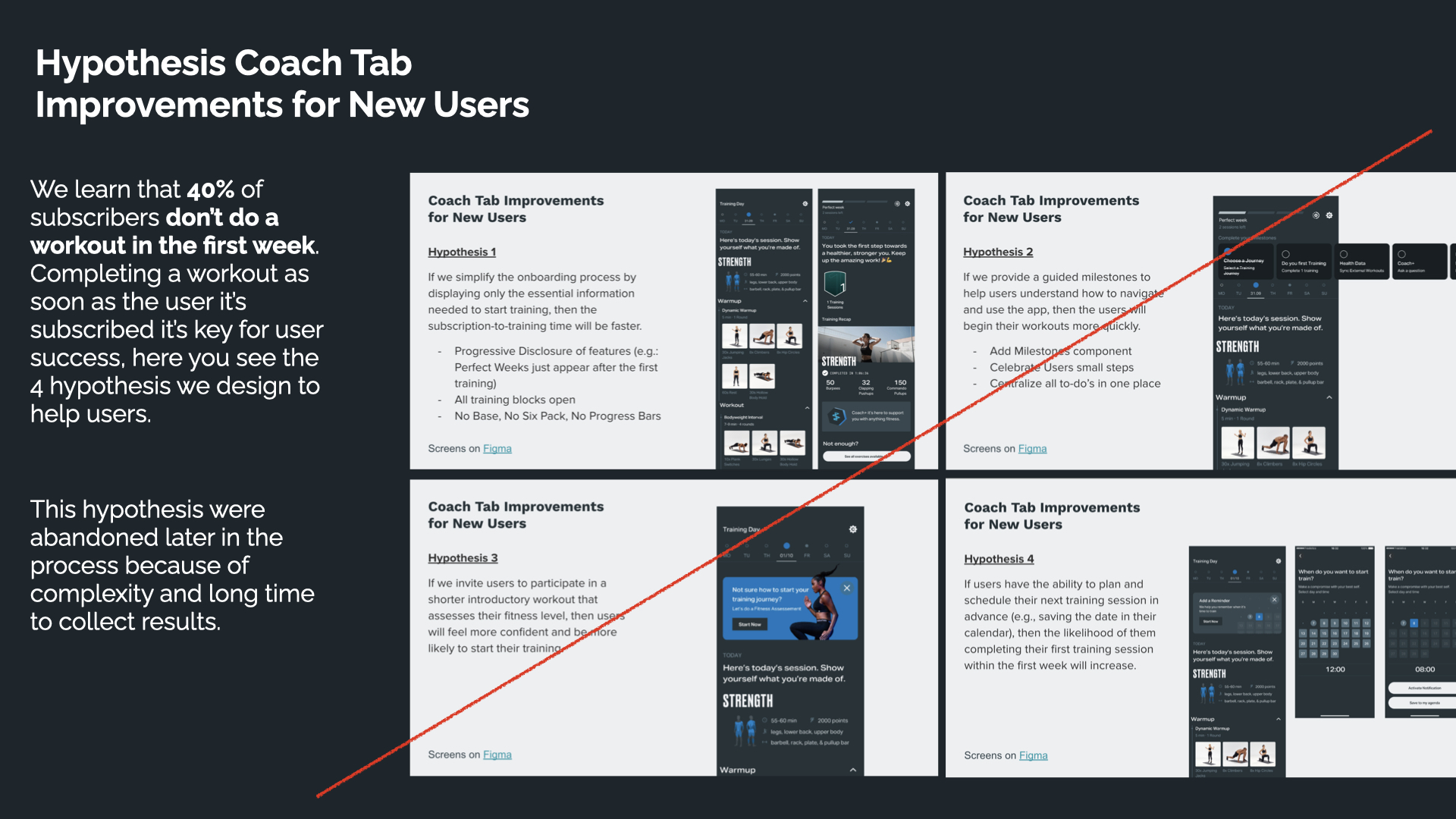
We learned that 40% of subscribers don't do a workout in the first week. We designed 4 hypotheses to fix that: simplifying onboarding, adding guided milestones, inviting a shorter introductory workout, and letting users schedule their next session in advance. These hypotheses were abandoned later in the process because of complexity and the long time it would take to collect results, not every good idea survives contact with delivery constraints, and being honest about that trade-off was part of the job.
Fig. 12 — Four hypotheses to improve first-week activation, later abandoned for complexity and time-to-results.
Improved Tile Boosts Clarity and Focus, Connecting Users to Their Training Journey
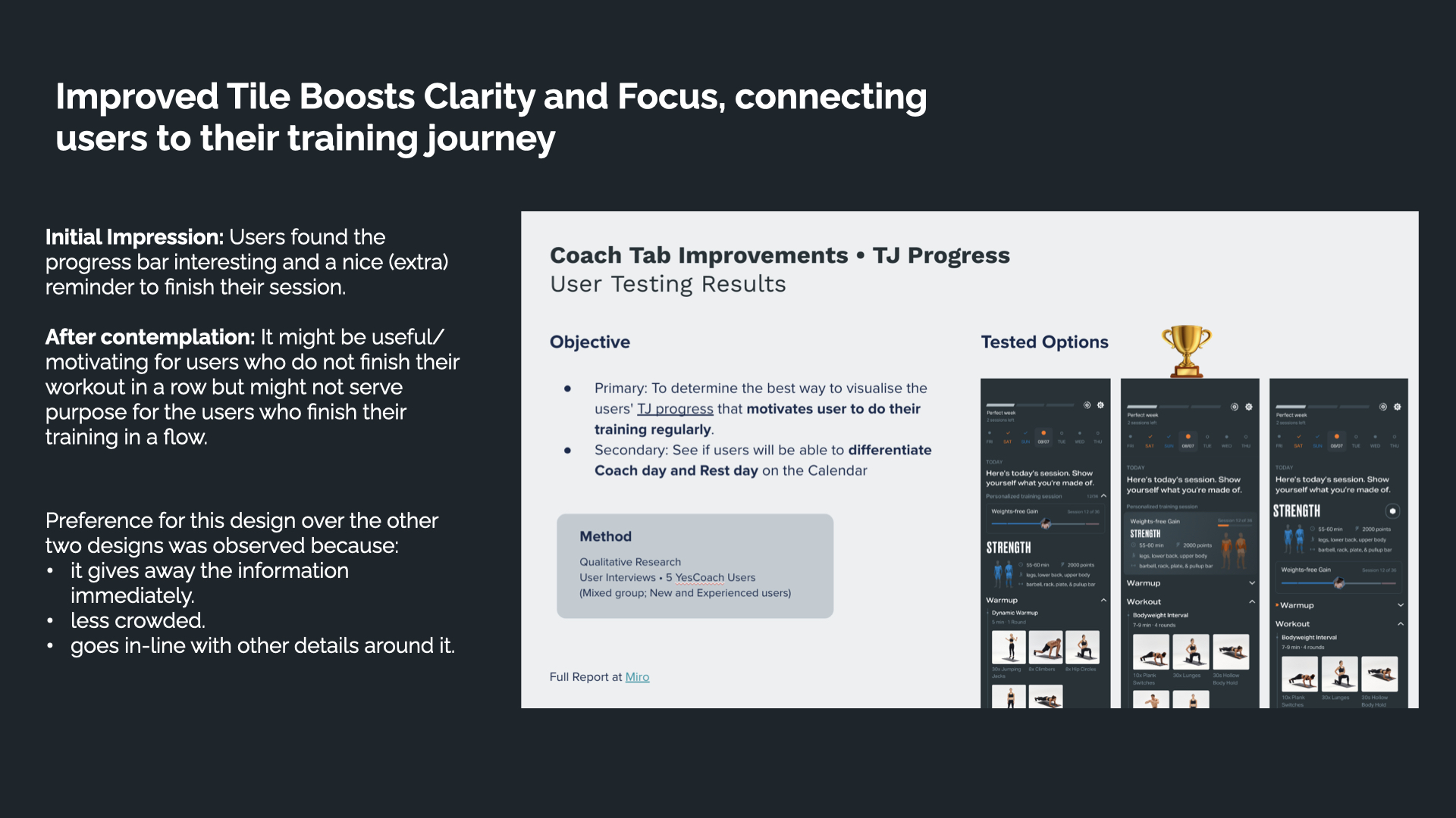
Initial impression: users found the progress bar interesting and a nice reminder to finish their session. After contemplation: it might motivate users who don't finish their workout in a row, but might not serve users who already train in a flow. We tested three visualization options with 5 YesCoach users; the winning design was preferred because it gave away the information immediately, was less crowded, and lined up better with the surrounding details.
Fig. 13 — TJ Progress tile testing: three options, one clear winner.
Redesign the Fitness Streak
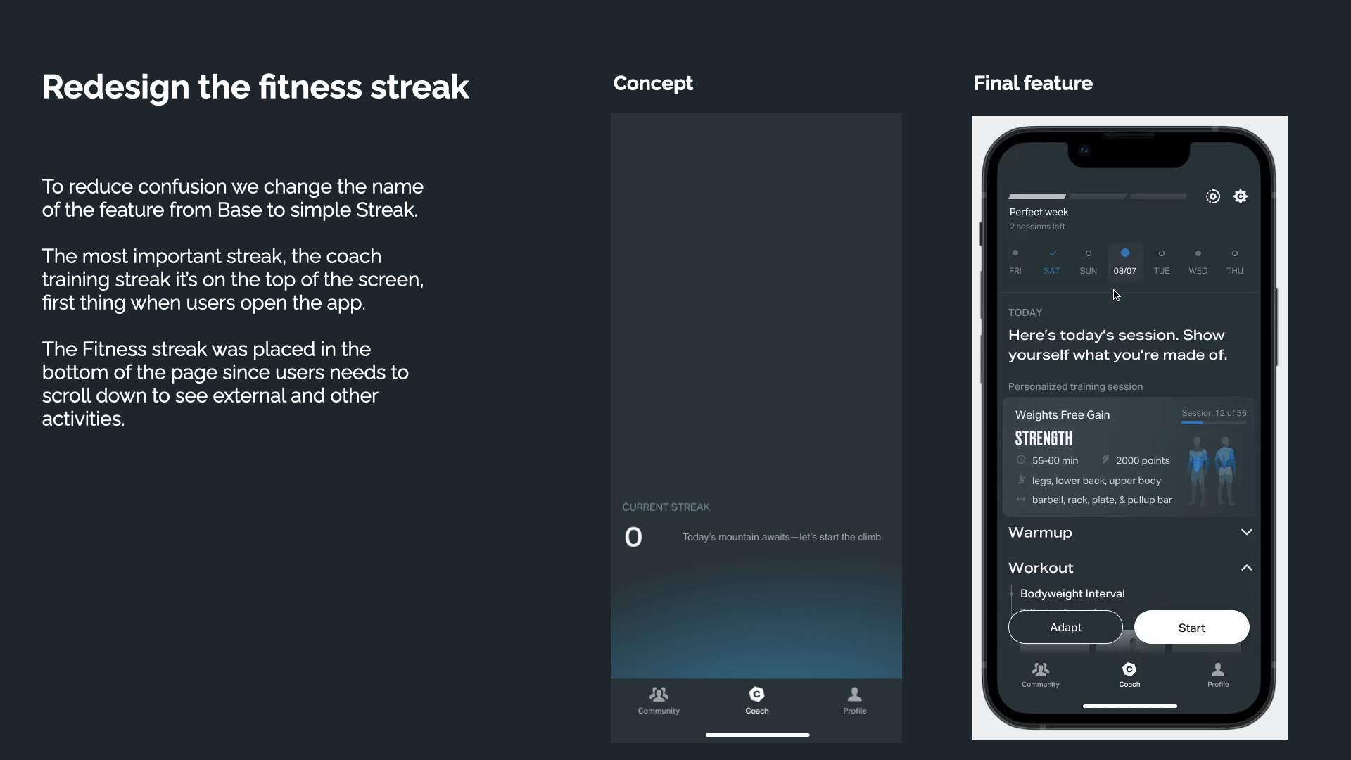
To reduce confusion we renamed the feature from Base to simple Streak. The most important streak, the coach training streak, sits at the top of the screen, the first thing users see when they open the app. The general Fitness streak moved to the bottom, since users need to scroll to see external and other activities.
Fig. 14 — Base becomes Streak: concept vs. final feature.
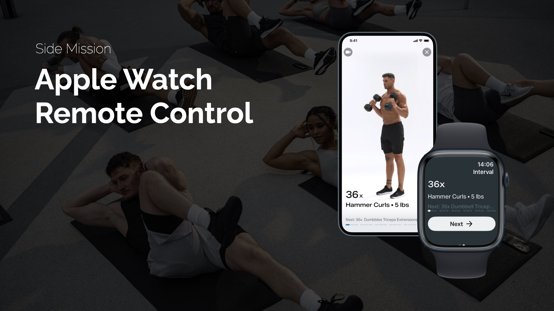
Side Mission: Apple Watch Remote Control
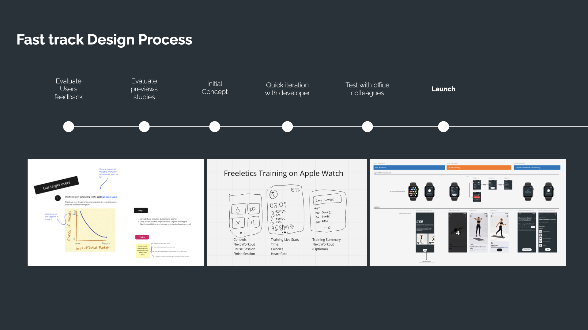
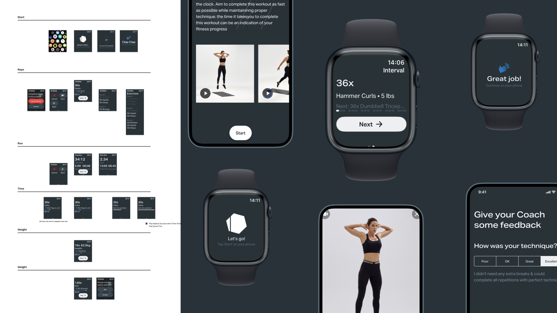
A user-requested feature that had been removed years earlier. We ran a fast-track process: evaluate user feedback and previous studies, initial concept, quick iteration with a developer, test with office colleagues, launch. Delivering a seamless control experience directly from the wrist, reducing friction and keeping users in the habit loop.
Fig. 15 — Apple Watch Remote Control.
Fig. 16 — Fast track design process, from user feedback to launch.
Fig. 17 — Detailed screens: start, reps, run, time and weight states.
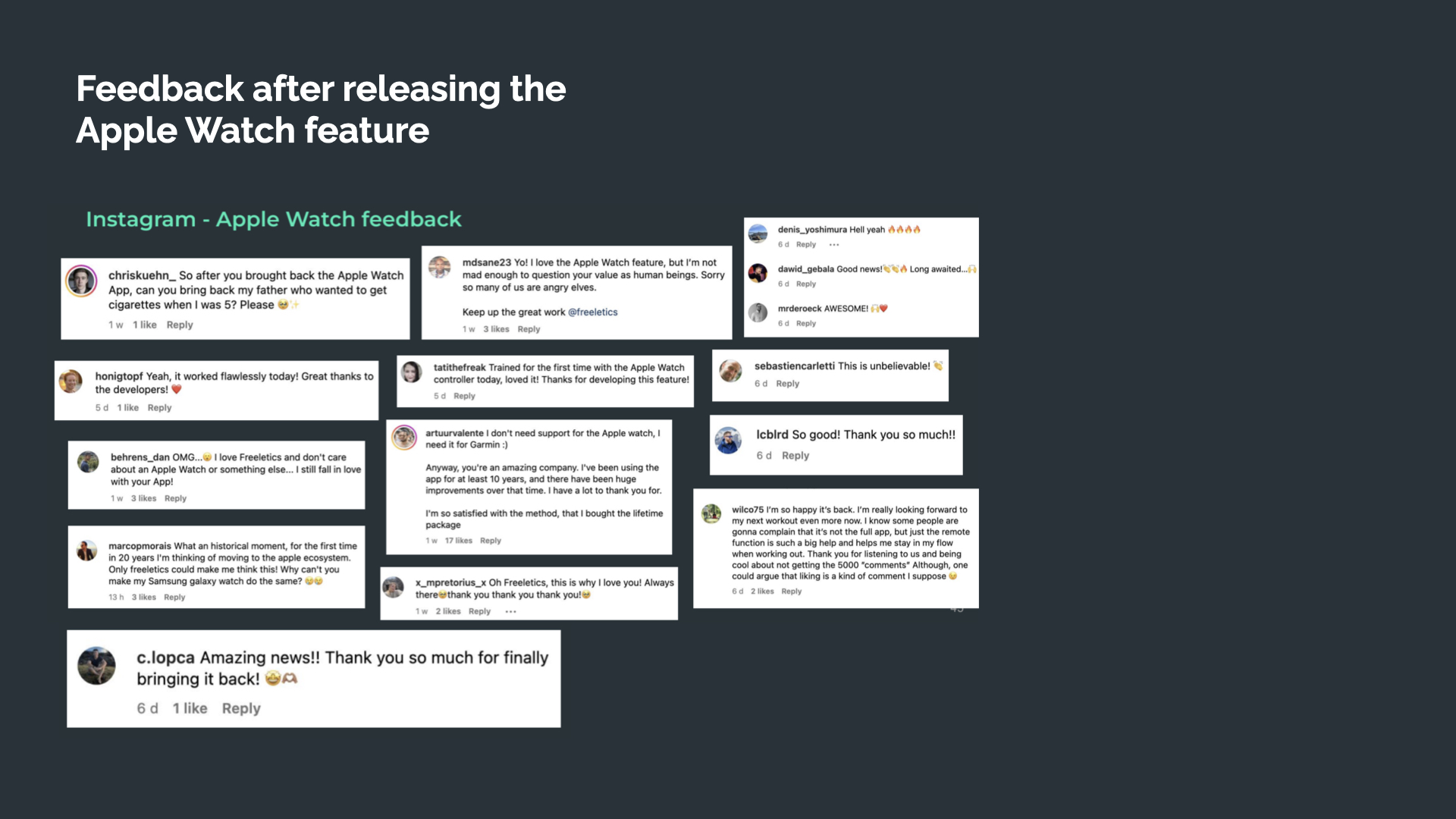
Real reaction after release, straight from Instagram: users thanking the team for bringing the feature back, some saying it was the reason they'd stay in the Apple ecosystem, others calling it a historical moment after 20 years without it.
Fig. 18 — Real user reactions on Instagram after the Apple Watch feature shipped.
My Role Between Directing and Execution
I aligned evolution and kept senior stakeholders in the communication loop, helped sketch the overall direction, and did direct design work at the start of the process. I collaborated with PMs, engineers and Data Scientists to understand implementation challenges and phase the rollout, worked with UX Research on discovery and testing, and pushed to find ways to introduce more movement into the experience.
Before / After
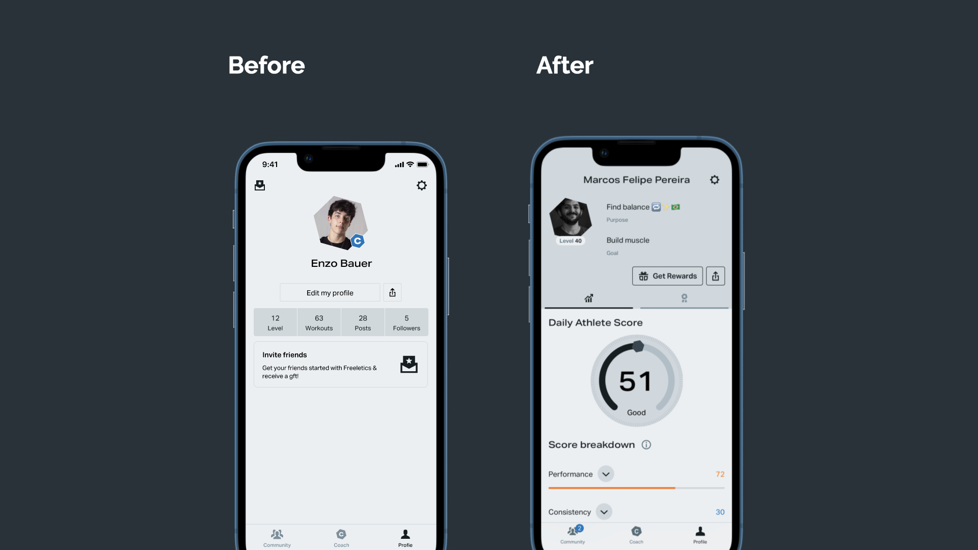
From a static profile with a name, a follower count and an 'edit profile' button, to a living Athlete Score that surfaces performance, consistency and rest. The profile went from a place users visited once to a place that gave them a reason to come back.
Fig. 19 — Before/after: from a static profile to the Athlete Score.
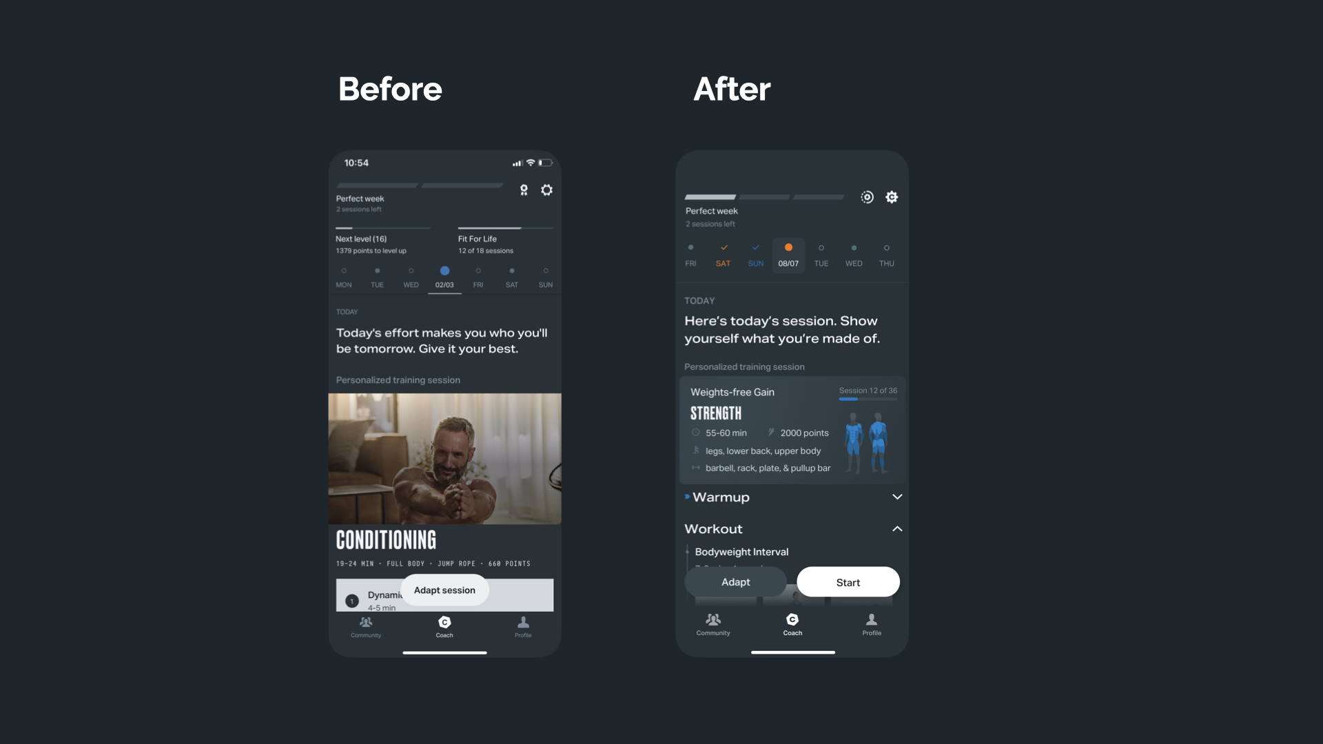
Reduce space for repetive photos and focus users on their own progress. The card element also make it easier to compare training between days, bringing the muscle groups to the front row.
Fig. 20 — Before and after Coach Tab
Results
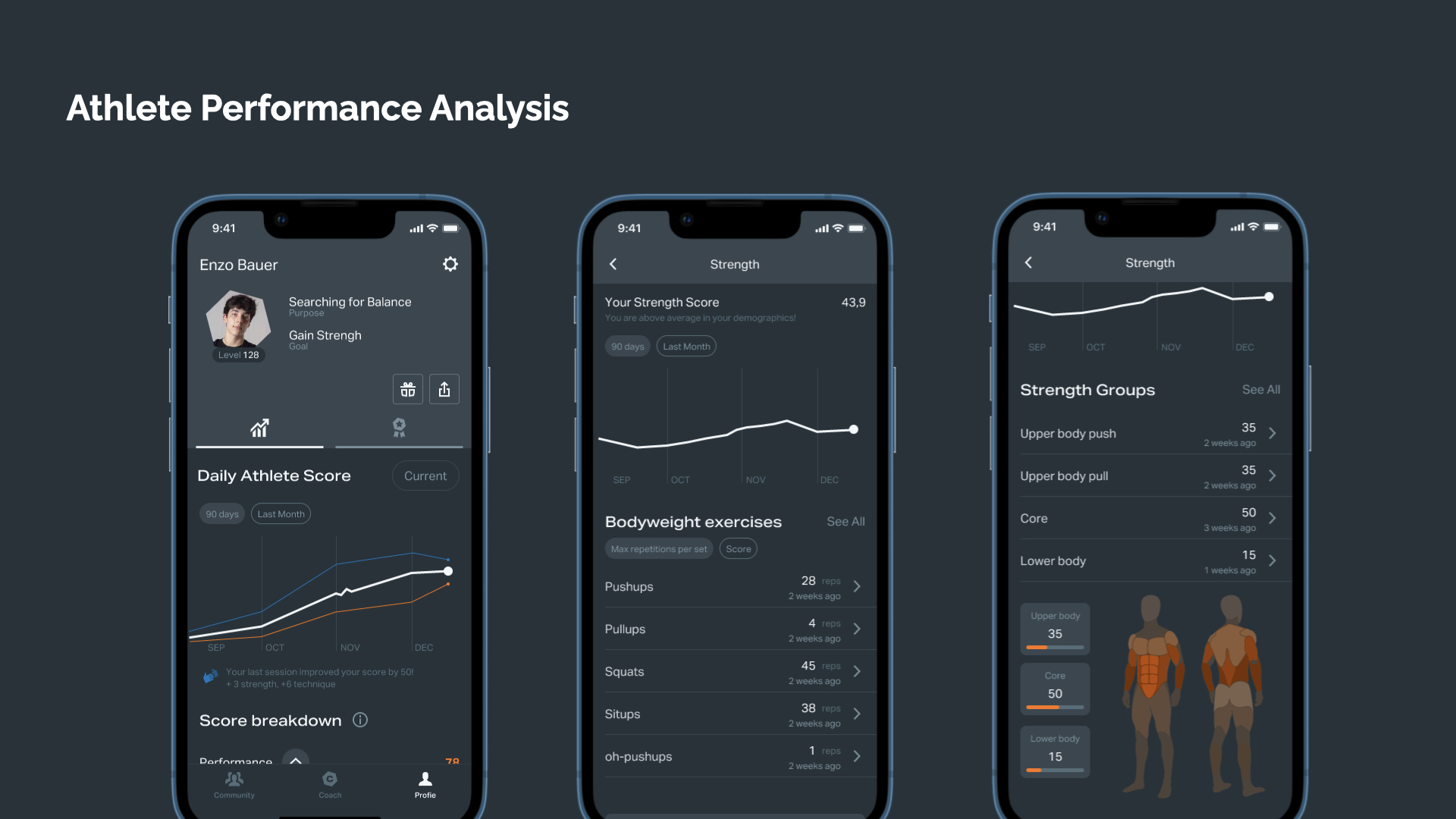
The Athlete Score expanded into a full performance analysis, strength trends, bodyweight exercise history, and a breakdown across upper body, core and lower body, all in one place.
Fig. 21 — Athlete Performance Analysis.
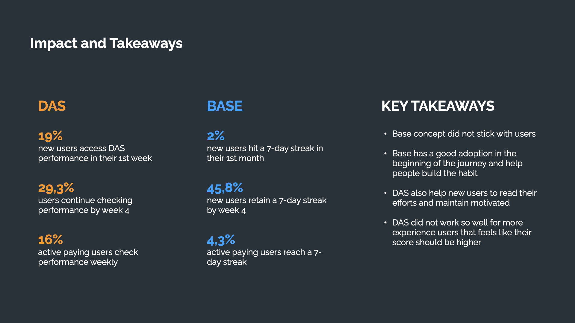
19% of new users accessed DAS performance in their first week, 29.3% kept checking it by week 4, and 16% of active paying users check it weekly, the score did its job of helping new users read their effort, though it worked less well for more experienced users who felt their score should be higher.
Fig. 22 — Key takeaways and adoption numbers.
Comparing DAS and Base side by side: Base had strong early adoption and helped people build the habit, while DAS helped new users read their effort and stay motivated, 45.8% of new Base users retained a 7-day streak by week 4.
Fig. 23 — DAS vs Base, side by side.
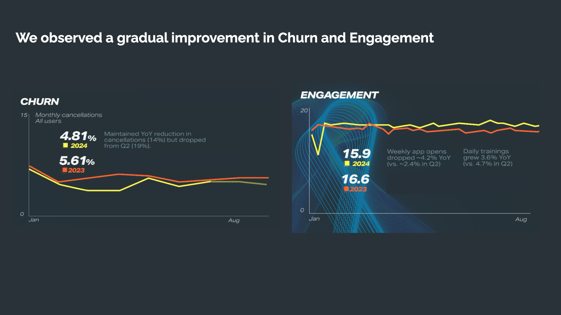
And the business result behind it all: churn maintained its year-over-year reduction, and engagement moved in the right direction, daily trainings grew 3.6% YoY while weekly app opens dropped only 4.2%, a much smaller decline than the previous quarter.
Fig. 24 — Gradual improvement in churn and engagement, year over year.