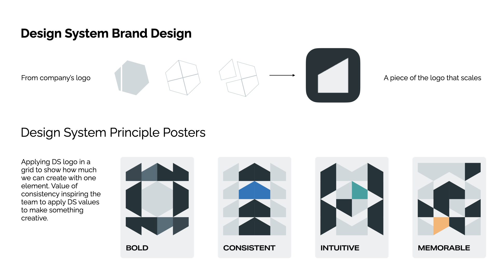
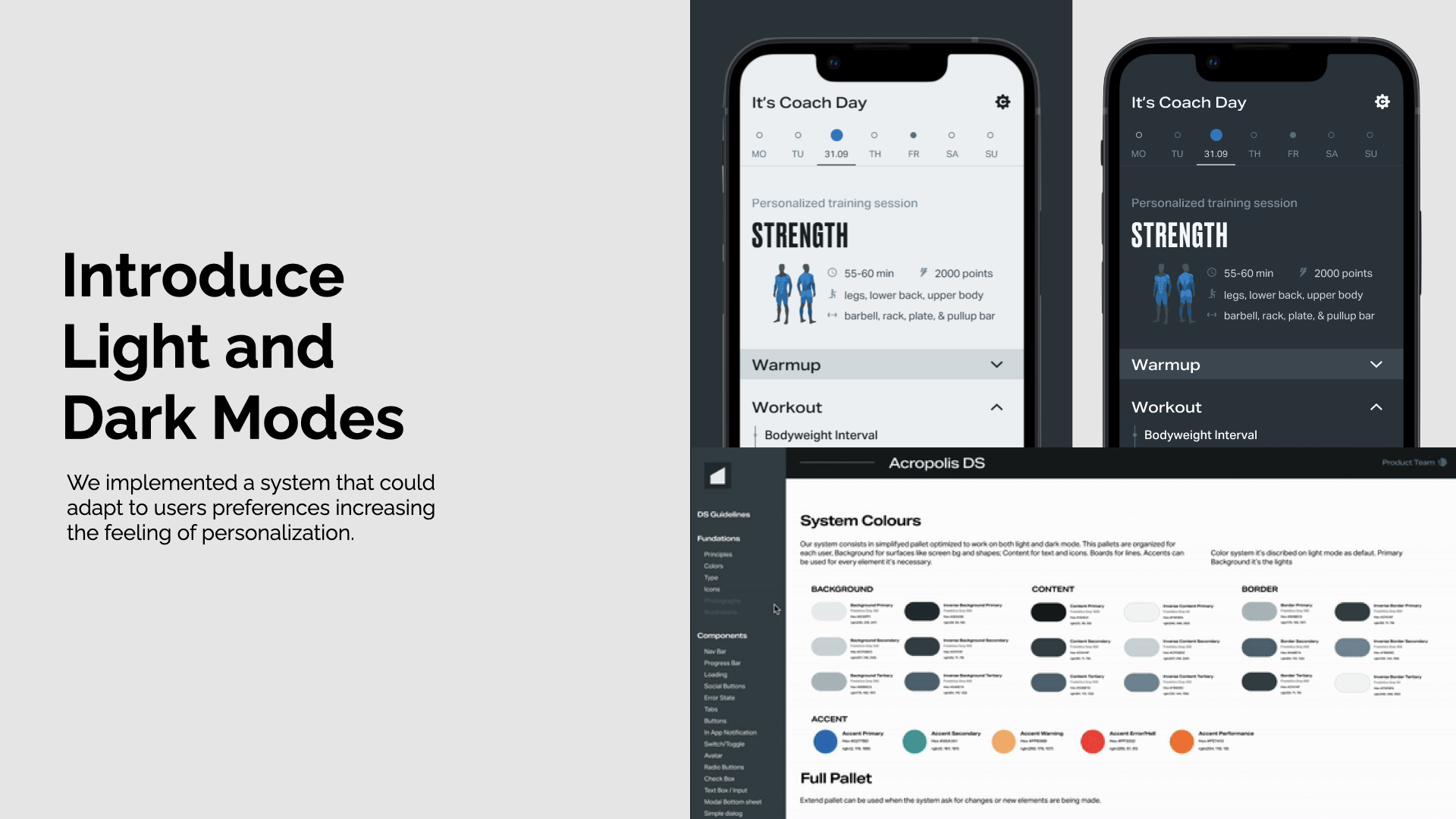
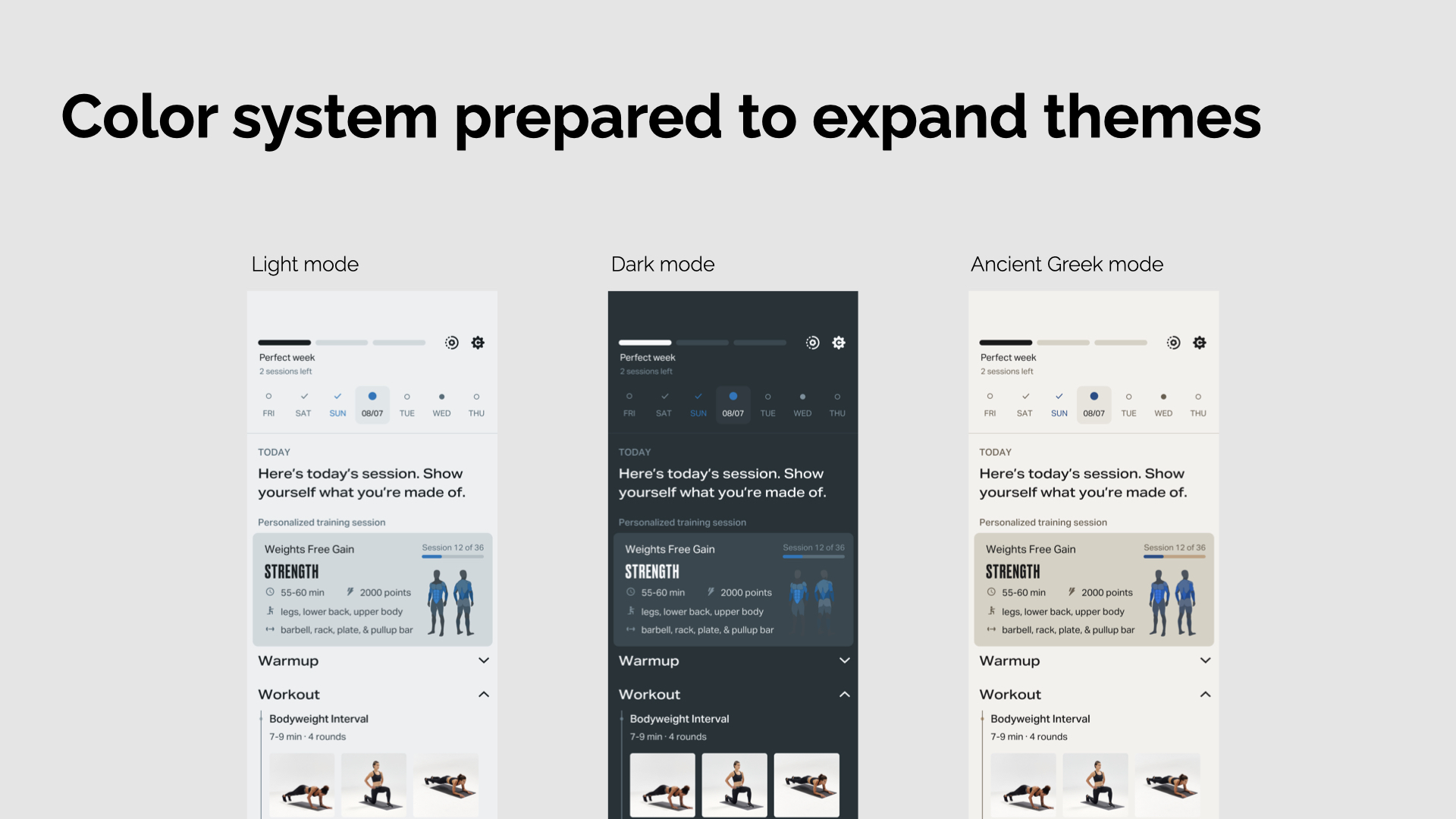
Design System Setup and Maintenance
Problem: Brand team was running a brand refresh our challenge was to align Marketing and Product in one clear vision and make the change create less friction for the user. Solution: an approach that delivered the new branding while letting us improve and change the experience at scale through a Design System implemented across all platforms —> Acropolis DS.
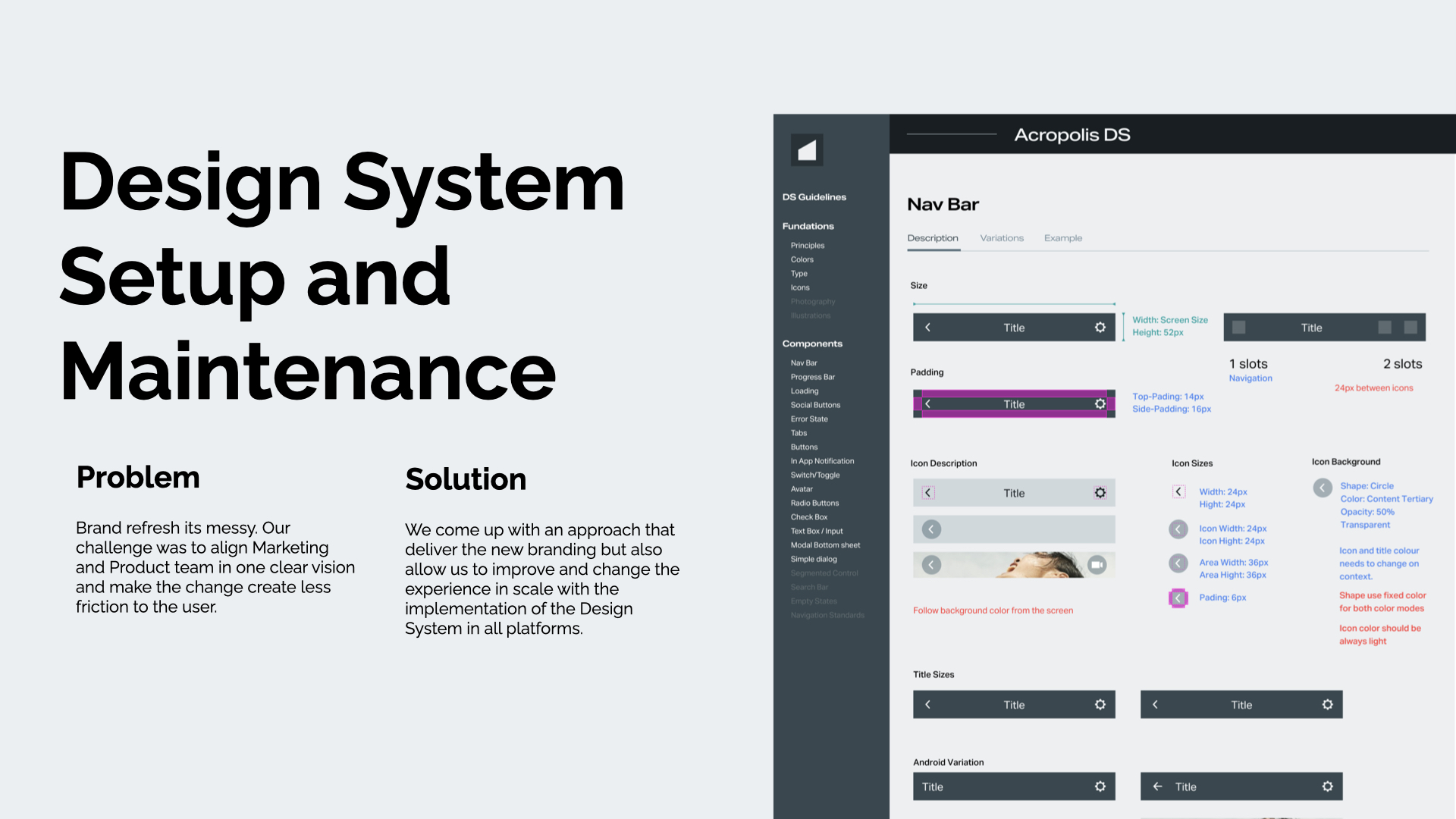
Fig. 01 — Acropolis DS Problem
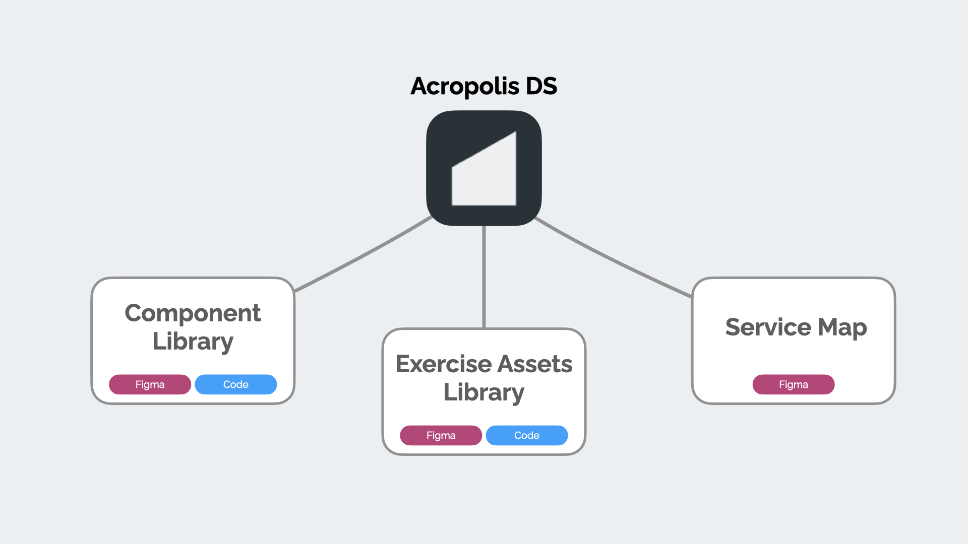
Fig. 02 — Acropolis DS Libraries cross platforms: Component Library, Exercise Assets Library, and Service Map.

Fig. 02 — Acropolis DS Libraries cross platforms: Component Library, Exercise Assets Library, and Service Map.
Fig. 03 — Acropolis DS Component Library
Component Library was organized on Figma and reflected in native repositories.

Fig. 04 — Exemple of a component on Figma with variations and stayling controls.